Sunday, 25 March 2018

Music Video | Analysing "Where is the love" - Black Eyed Peas

In a group of 3, we each analysed the narrative music video "Where is the love" by the band the Black Eyed Peas. We discussed the historical, cultural and social contexts of the video, as well as other relevant points.

Friday, 16 February 2018

Music Video | Contextual information

I have studied the following two songs; "Titanium" - David Guetta & "Unfinished Sympathy" - Massive Attack and created a table discussing the meaning of the songs/lyrics, representations conveyed in the music video, where it was set, historical/social/cultural events and media language traits. 


Sunday, 11 February 2018

TV drama | Deutschland 83' context & narrative

Context:
  1. Social - gender roles, racial and ethnic inequalities, social attitudes to sexualities
  2. Cultural - TV drama in reflecting culture, reinterpreting and reinforcing national cultural identities
  3. Historical / Political - knowledge and understanding of the influence of historical events 
Theoretical Framework:
  1. Audience - national/international representations, archetypal themes (original representations), differentiation in representations, how it targets different audiences
  2. Media Language - conventional characteristics, how it serves to decrease differentiation
Notes:
  • cultural amnesia
  • the historical trauma of German division and reunification
  • difficulties faced by Germany and its people
  • political and military tensions
Narratology in Deutschland 83':

  • initial equilibrium consists of Martin's girlfriend, stable job and good family life
  • disruption involves the US president Ronald Reagan's escalation of the Cold War
  • theory limits its effectiveness in understanding complexing narratives
  • not designed to explain serial narratives like long-term dramas where climax and resolution are necessarily delayed
  • does not help to understand media television's tendency towards segmentation rather than linearity (multiple segmented storylines of some long-term dramas)
  • does not help to understand narrative strands that do not add to the narrative drive towards resolution, but establish characterisation, spirals out from the main linear narrative or creates cliffhangers
Notes:
  • Lenora's equilibrium is Martin's disruption
  • Martin is seen as powerful in his job as a border patrol officer as he is seen from a low camera angle facing up to him and a high camera angle whilst he is looking down on others
  • Martin was laughing, having fun, is highly respected, was able to visit family and friends regularly with his life in the east
  • during the disruption of ep.1 the atmosphere appears to feel sinister and nerve-racking (seen in the choice of music, colour tones and expressions of the characters)
  • the ending does not properly provide an equilibrium again as the narrative theory does not fully apply (equilibrium is far away)

TV drama | Todorov's theory of narratology

Todorov's Narrative Theory:
states that most stories and plot lines follow the same pattern in 5 steps
  1. Equilibrium - a happy start where the majority of the characters are content and everything is as it should be
  2. Disruption - features a problem or drawback which will disrupt the happiness/optimism
  3. Realisation - when characters are conscious of the problem and its chaos 
  4. Restored order / Climax - individuals attempting to repair the damage and restore the complication
  5. Equilibrium again - the final part of the plot where the obstacle if resolved and normality can resume again
Todorov suggested that stories begin with an equilibrium or status quo where potentially opposing forces are in balance. A state of stability is followed by a disruption of the balance by some action, recognition of the problem takes place, there is then an attempt to restore the commotion and a reinstatement of the equilibrium. This is very common and can be applied to many mainstream film narratives. The human mind needs a narrative to make sense of things, we connect events and make interpretations based on those connections, in everything we seek a beginning, a middle and an end.

Friday, 2 February 2018

Music Video | Mainstream vs Alternative Music Videos

Mainstream:
Mainstream music videos are usually located in urban, non-rural environments which are somewhat city based; for example the music video Massive Attack - unfinished sympathy which is set in non- suburban area. Mainstream videos use a narrative element of performance as well as an element of hardship as they use the diversity of all age groups, races and ages whilst the artist is performing as the main feature which is used for exposure.

Alternative:
Alternative music videos are more commonly set in suburban, unexceptional environment which is mainly based in the fringe/district; for example the music video Titanium - David Guetta ft. Sia. The artist does not usually perform as it can consist of a narrative and a conceptual music video. In the music video, I looked at there was limited representation and diversity and most alternative music videos would have a sinister element to them.

Intertextuality:
The shaping of a media text through reference to another media text; some texts may refer directly to each other for example a remake of a movie or show, by reference to the original media text. This is influenced by the audiences prior knowledge of the said text.

Post-Modern Approach:
Text may show awareness of itself by paying homage (respects) to its original text.

Monday, 1 January 2018

Shelter Advert

The Shelter campaign uses a variety of techniques to persuade viewers to donate or raise awareness by spreading news, one of the main aims of Shelter is to provide homeless people/disadvantaged groups to retain living standards and comfortable housing. The campaign often uses similar approaches towards their target audience, one of which is the display of contact information on each poster which allows the viewer to find them directly and get into contact with their services whether it be for advice or donations, as well as using the letter 'H' in the title appear to look like a house which makes it obvious what the campaign is targetting towards achieving. Another consistent method is displaying a person, one who looks upset or dismayed to grasp the viewer's attention and make them aware of the difficulties some people are going through, the person is usually staring directly at the camera which creates the effect that they are directly asking the audience for help. The campaign also has a regular display of statistics, this brings the viewer back to reality and makes them realise how existent these problems are. Lastly, the colour red which is signified to relate to 'danger', 'seriousness' and 'pain' build effect on the audience by subtly revealing the harsh truth to reality. 


Evaluation Question 4.

Sunday, 10 December 2017

Evaluation Question 3.

For this question, I was asked to go over any improvements I could make to my product with a member of my target audience (16+). The target audience member is a 17-year-old college girl.


A few things my target audience member found appealing was the name of the magazine definitely sounded artistic in a musical sense. I was also consistent with my colour scheme and used colours that complimented each other. I was able to use the right image for my background as it looked as if the model was directly looking at the reader (angle of gaze). The layout of the front cover and contents page had been nicely developed and looked similar to most music magazine layouts. The features I had used were relevant to today as they are current affairs and they are all real which definitely made it appear to be more realistic in that sense. After editing the models face with the 'spot healing' tool, I made the model appear to have "barely any flaws".


From what I gathered from my target audience member, she would like me to photoshop the models features more to accentuate certain areas of the models face. I then adapted from this critique by airbrushing the models face slightly so some spots and pores weren't visible and used an enhancer tool to make the eyes light brown. I was also asked to perhaps sharpen the photo of the model more to outline the features of her face, I was able to do this by using a 'sharpen edges' tool on photoshop which created a better emphasis on the facial structure. Another renovation I was asked to make was to move one of the features of the front cover models face and place it in order of length which I have done for both my front cover and contents page which made the layout look more cleaner and professional. Lastly, the final critique I was asked to do was somehow try and use darker colours that could reflect a hip-hop genre, I found this quite difficult to accomplish since I had used light gels to photograph my model instead of using photoshop to create layers. Therefore I tried to darken certain areas around the model; hair and clothing.

Sunday, 3 December 2017

Evaluation Question 2.

Powered by emaze

Evaluation Question 1.

Created using Visme. Free Online Presentation Software.

Preliminary Task: Flat Plan

I have started to design a flat plan for my magazine front cover and contents page, my initial theme was for an 'urban' and 'edgy' display and representation of Hip Hop, but whilst going over the answers I had gotten in my survey and focus group I came to a conclusion that the magazine should look professional and 'classic', but still incorporate some urban features. At first, I created some sketches as to what I pictured the final proposal to look like and then researched well-known music magazines in an urban/hip-hop genre to get inspiration for what I should incorporate. I picked up on a few techniques that most magazine companies use on their front cover and combined it with my ideas, for example, the layout of the texts and features, typefaces (fonts), colours and model shots.


The flat plan of my front cover was inspired by two different music magazines; Billboard and Vibe. I researched the different and similar techniques they used and incorporated some in my work. Some of the techniques I used was 'dividers' to separate features by using ' + ' and ' __ '. Another technique I included was design layouts; the masthead is usually on the top, the feature on the left side or whatever side the model was facing, the barcode and pricing placed on the bottom left. Apart from the techniques I incorporated from other magazines, I also researched photographs of hip-hop artists for inspiration and wanted to experiment with light gels (different coloured lighting), and lastly, to make it appears legit and realistic I added social media icons along with a "Find more about us on..." and a "Limited edition" sticker. Whilst keeping up with my aesthetic, I constantly checked whether the font types I initially picked out would suit my page layout on Photoshop whilst creating drafts and came to a conclusion to use only 3 font types on my front cover page which consisted of Onyx (masthead), Haettenschweiler (features) and Century Gothic (other texts).


The flat plan of my contents page I intend on including the use of light gels, but with a pink and blue filter instead of red and yellow which will be used on my front cover. Upon contemplating layout approaches, I had researched and analysed a range of magazine contents styles to create a brief idea of what I wanted my final draft to look like. Initially, I wanted my features to take up the majority of the bottom half of the contents page, but after choosing the final picture I would use the layout did not compliment the pose, therefore I had to slightly alter my layout. The font type I intend on using is 'Century Gothic' as the text because it looks very professional and some of the music magazines I have been using as inspiration (Vibe and Billboard) also have a similar choice typeface and 'Haettenschweiler' for the features subheading because it was very bold and eye-catching.

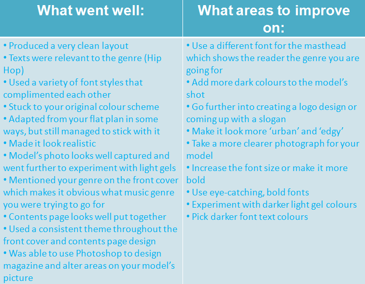
Preliminary Task: Feedback on design

After gathering feedback from a few of my peers who were the exact age of my intended target audience, I decided to write down their critiques and opinions on a table and try to act on them with my present draft.


Advertisement & Marketing Lucozade

I was asked to find two Lucozade posters one from before the 1980s and one which is contemporary (last 5 years) and deconstruct them. There is a clear distinction between the two which establishes how much technological convergence has evolved from the 1980s to modern times now. The modern day one uses celebrity endorsement (Gareth Bale - footballer for the Spanish club Real Madrid and the Wales national team) to promote more people to buy it as well as directing their target audience head-on; using an athlete to get the product across to other sports people. Whereas the 1980 one was initially created for medical usage on children and had an entirely different marketing strategy; drawn/cartoon picture of a mother feeding her child the medicine, label/logo, target audience and ingredients inside the drink.


Sunday, 19 November 2017

Preliminary Task: Model consent forms

Here are the people that were apart of my focus group and took part in my survey along with my model for my magazine front cover and contents page: